Kitchen Worktop Colour Ideas: What Works With Your Cabinets
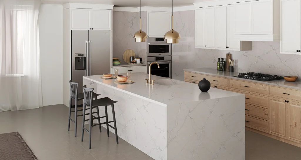
The best worktop colour depends on your cabinets. Here are the pairings that work, shown in real kitchens with stone from our range.

In this article
Choosing a kitchen worktop colour is rarely about the worktop alone. Whether you are planning a new kitchen or updating an existing one, it has to sit with your cabinetry, your wall colour, your floor and the natural light in the room, and it will be there for the next fifteen years. The good news is that a handful of pairings work almost every time.
Below we have grouped these kitchen worktop ideas by cabinet colour, because that is usually the decision people have already made. Every photograph is a real worktop from our range, so you can click through to see the exact stone.
What is the best colour for a kitchen worktop?
There is no single best colour, but there is a safe starting point. A warm white or soft grey quartz worktop with gentle veining suits almost every cabinet colour, copes well with low natural light and stays timeless as the rest of the kitchen design changes around it. It also hides everyday marks better than a flat white or a flat black.
If you want more character, use the worktop to create contrast: a dark worktop on pale cabinets, or a light worktop on dark ones. The sections below show what works with each cabinet colour.
White kitchens
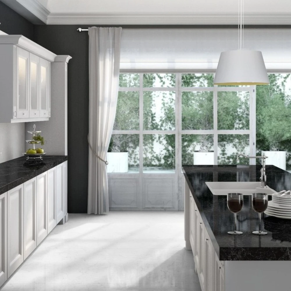
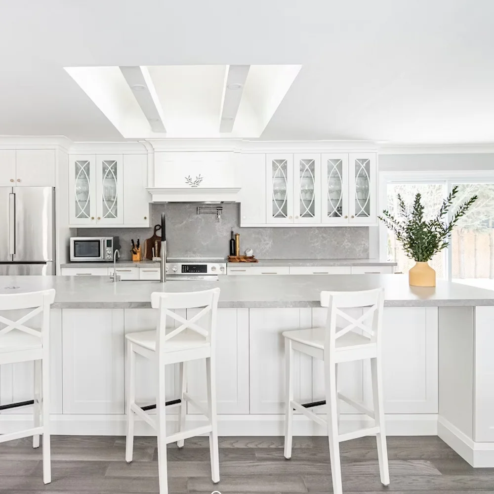
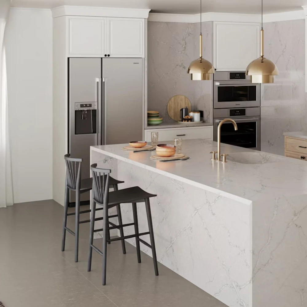
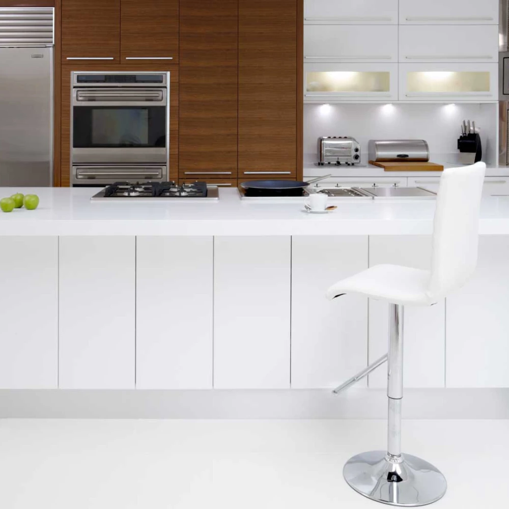
A white kitchen gives you the most freedom. The two directions that work best are high contrast and soft continuity.
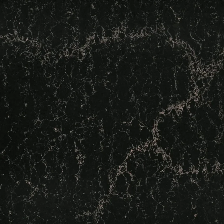
- Black worktops give a sharp, monochrome look and stop a white room feeling clinical. Vanilla Noir has a subtle fleck that hides crumbs better than a flat black, while Black Mirror is a deeper, glossier option.
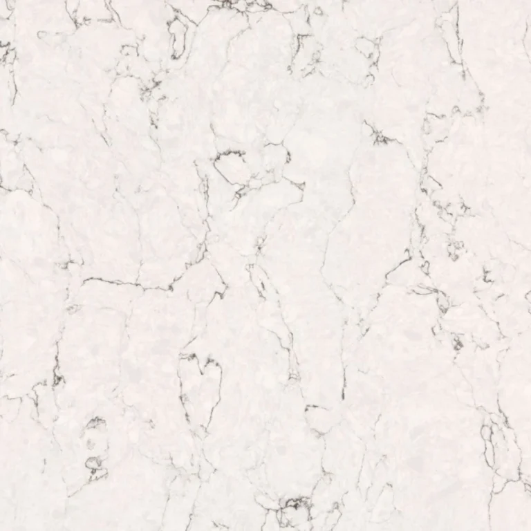
- White or marble effect worktops create a bright, seamless kitchen. Choose one with grey or gold veining so the surface still reads as stone rather than disappearing into the doors.
See the full range of white worktops and black worktops.
Grey kitchens
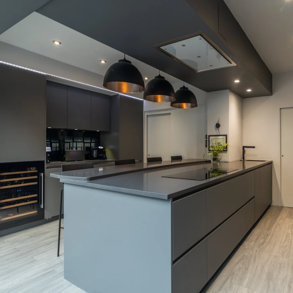
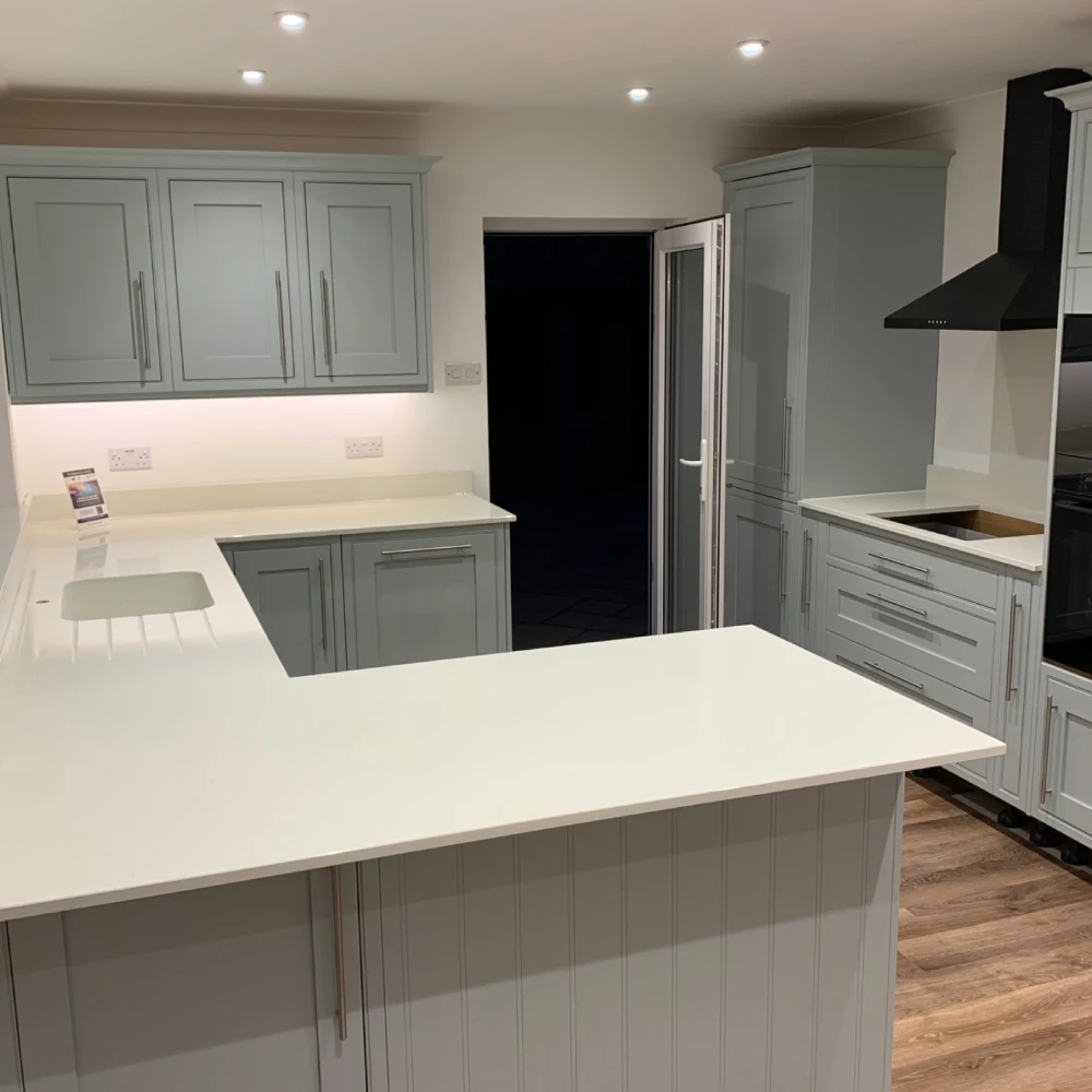
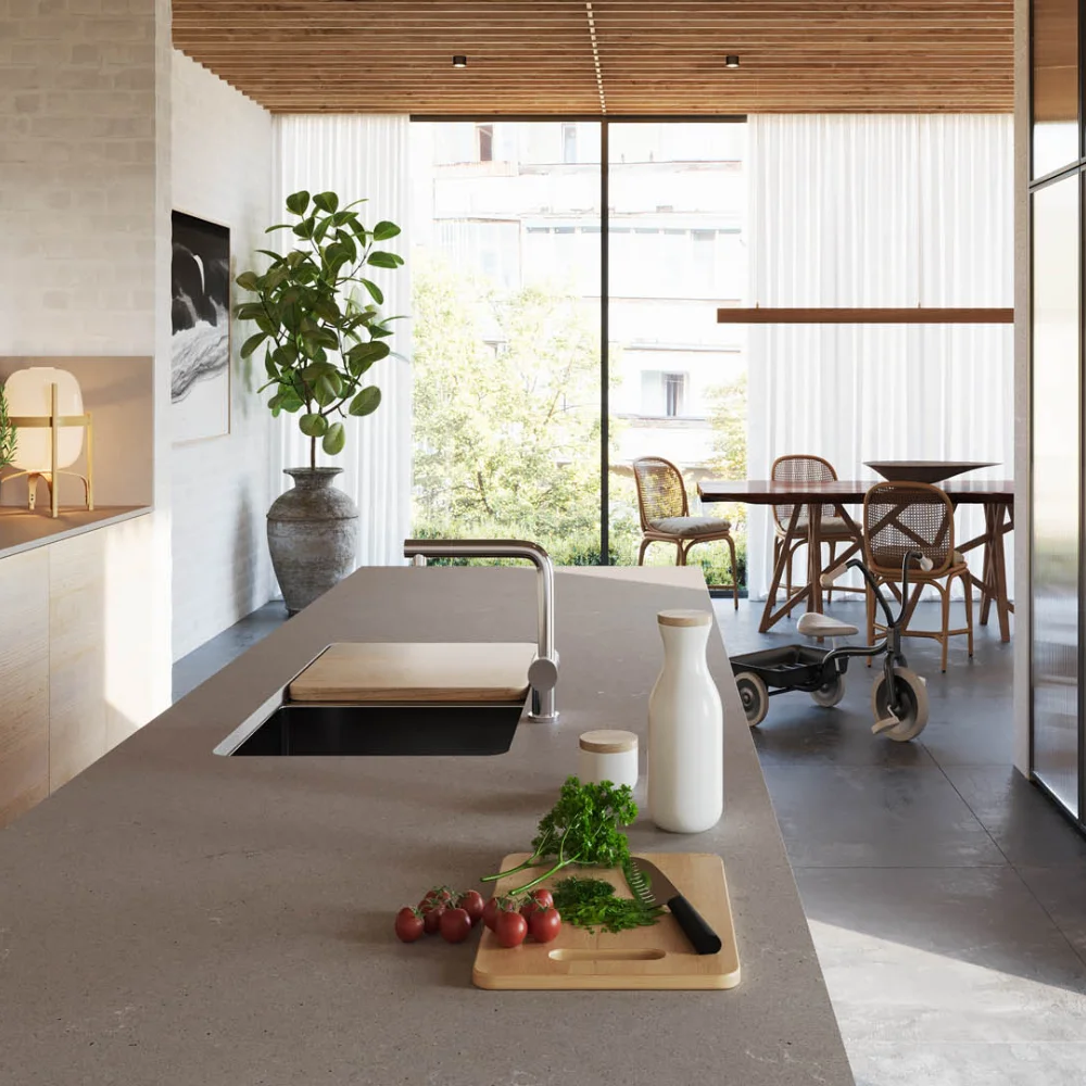
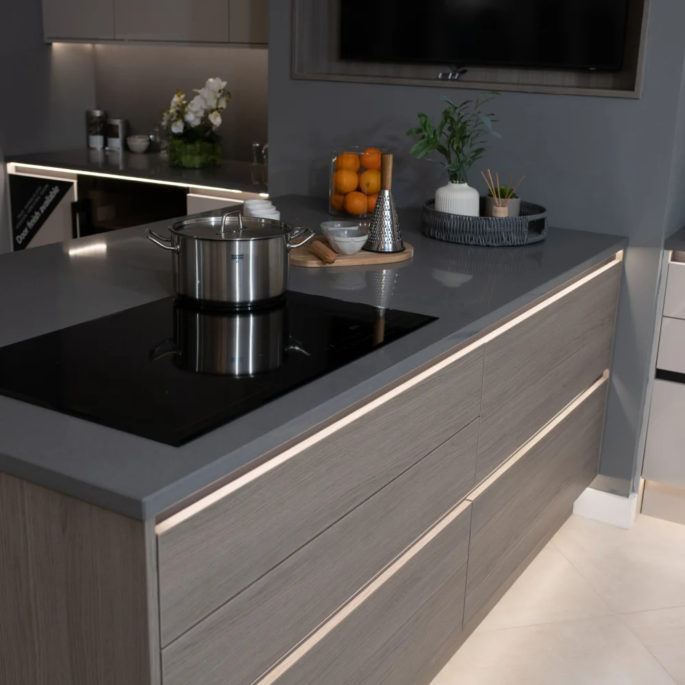
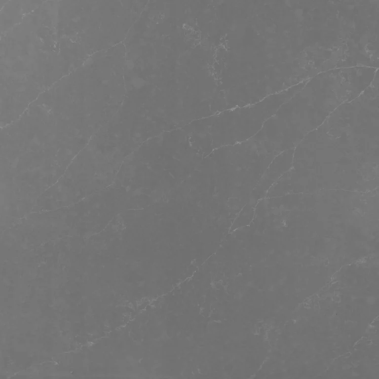
Grey cabinets suit both ends of the scale. A white worktop lifts mid and dark grey doors and keeps the room light, which matters in north-facing kitchens. A darker grey or black worktop on grey doors gives a tonal, architectural look, as with Marengo above.
Concrete effect quartz such as Raw Concrete and Airy Concrete is a good middle ground: it adds texture without introducing a new colour.
Browse grey worktops.
Sage green kitchens
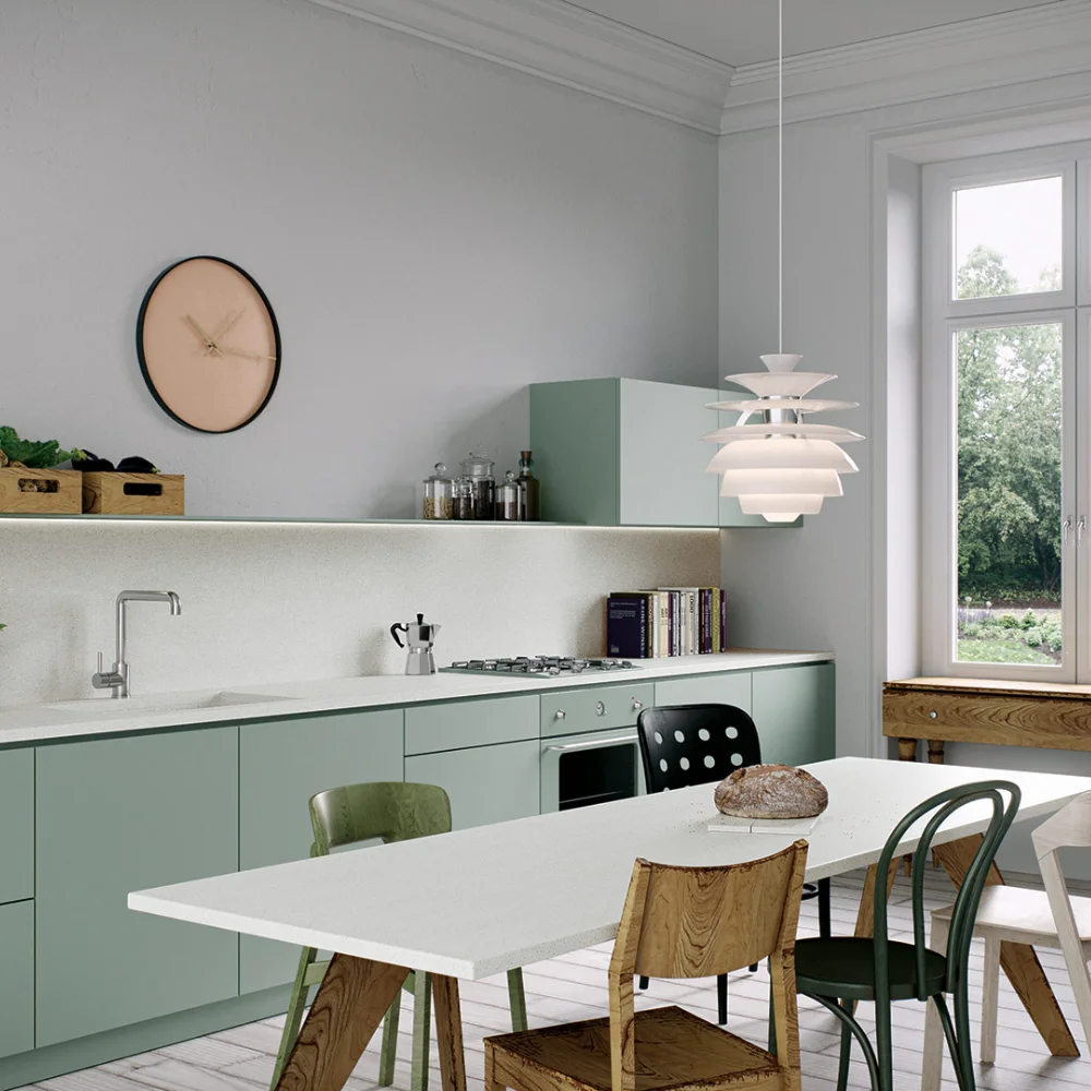
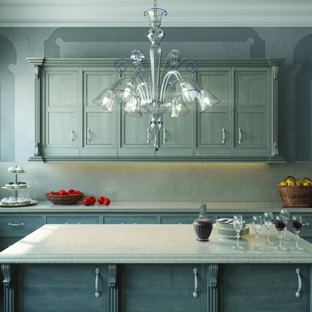
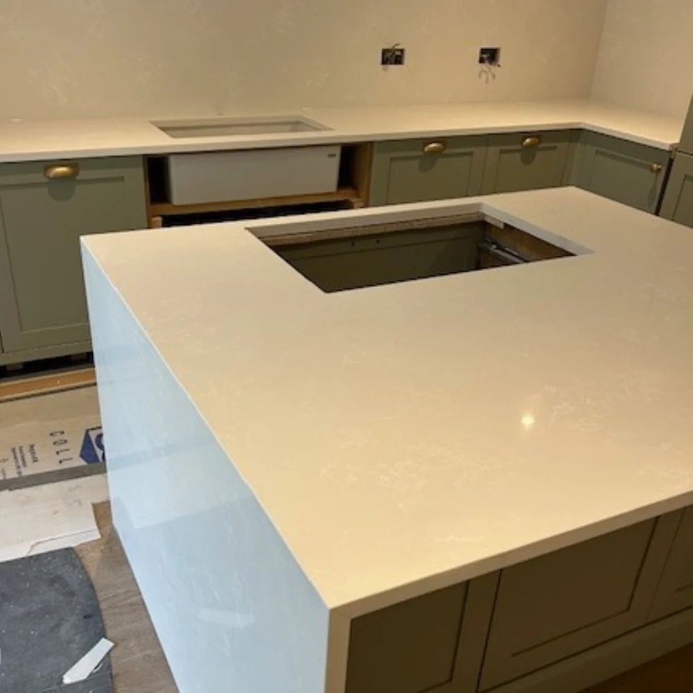
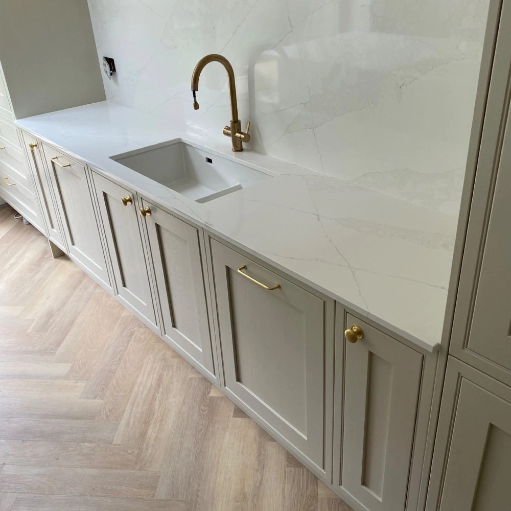
Sage green is one of the most popular cabinet colours of the last few years, and it is very forgiving with worktops. Clean whites such as Intense White keep it fresh and Scandinavian. Soft, lightly veined stone such as Bianco Drift gives a more traditional, country feel.
Brass or gold handles and taps sit well with sage. If you go that way, a worktop with a faint warm vein ties the metalwork in.
Dark green kitchens
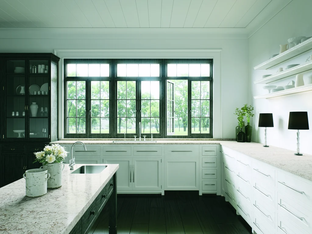
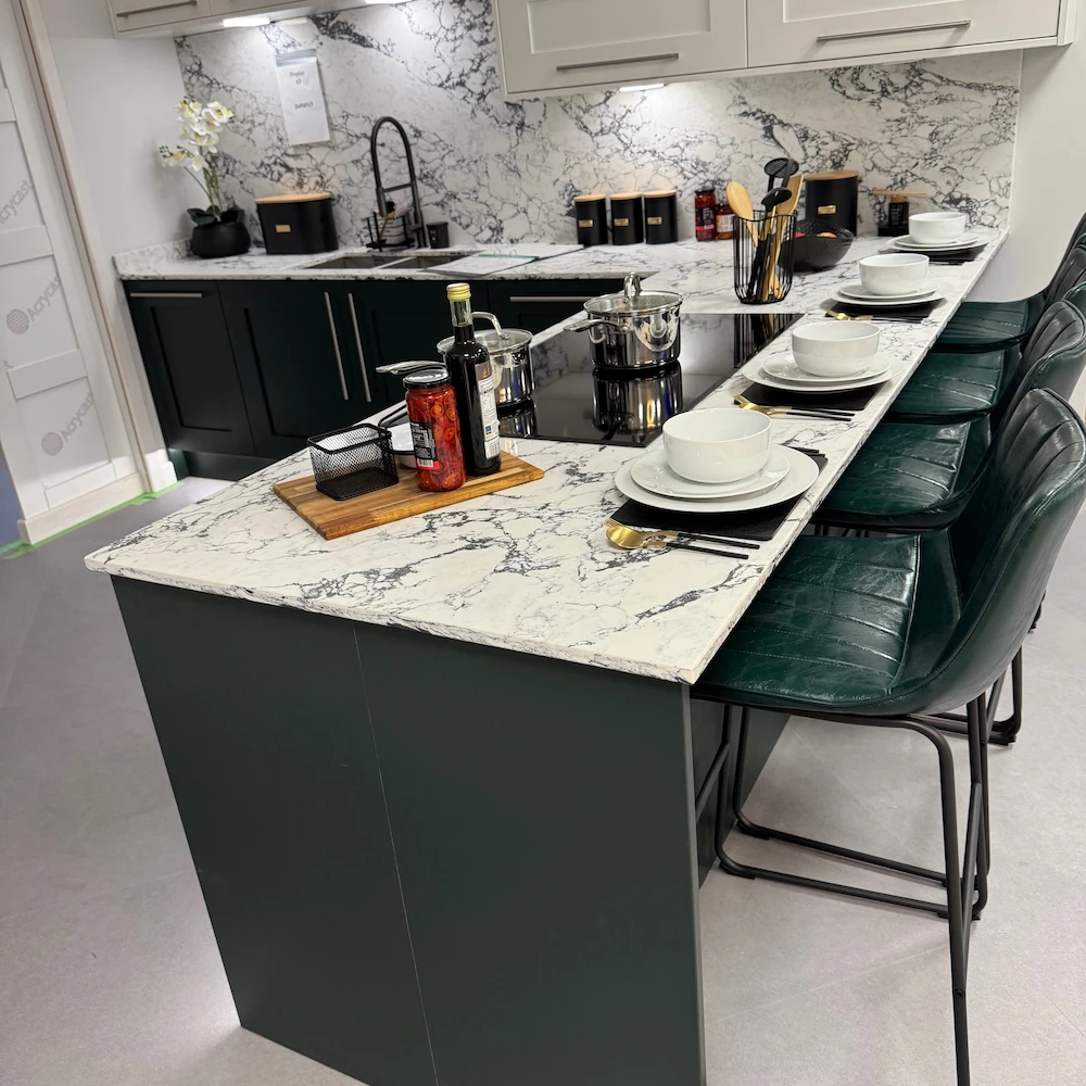
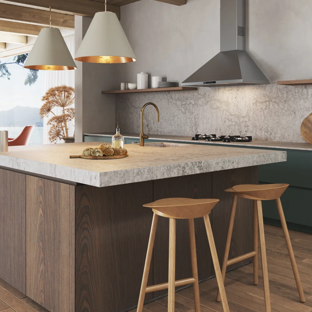
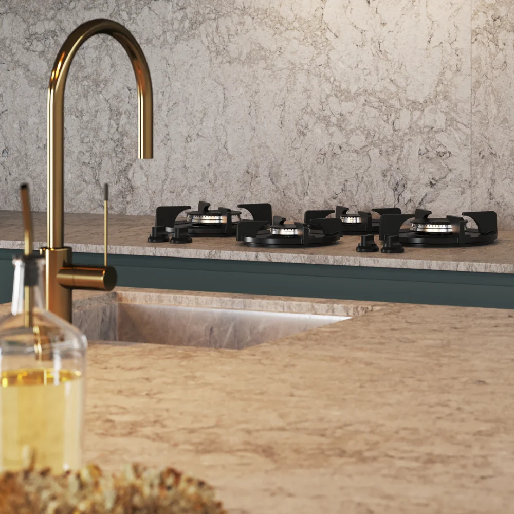
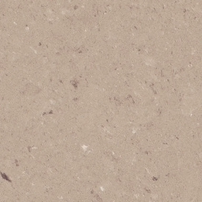
Deep green doors need a worktop that brings light back into the room. Warm whites and soft greige stones such as Moorland Fog work far better than stark brilliant white, which can look cold against a rich green. Black worktops are possible here, but only in a large, bright room.
Navy, charcoal and black kitchens
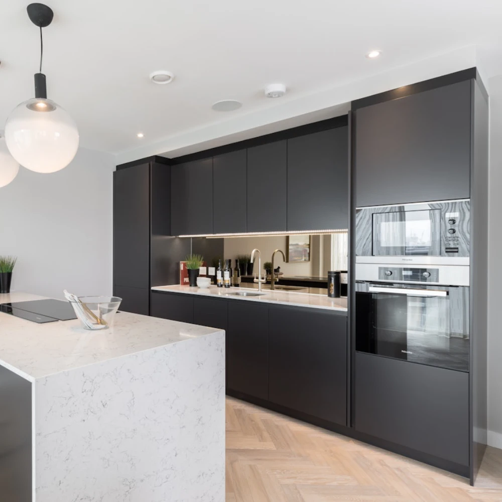
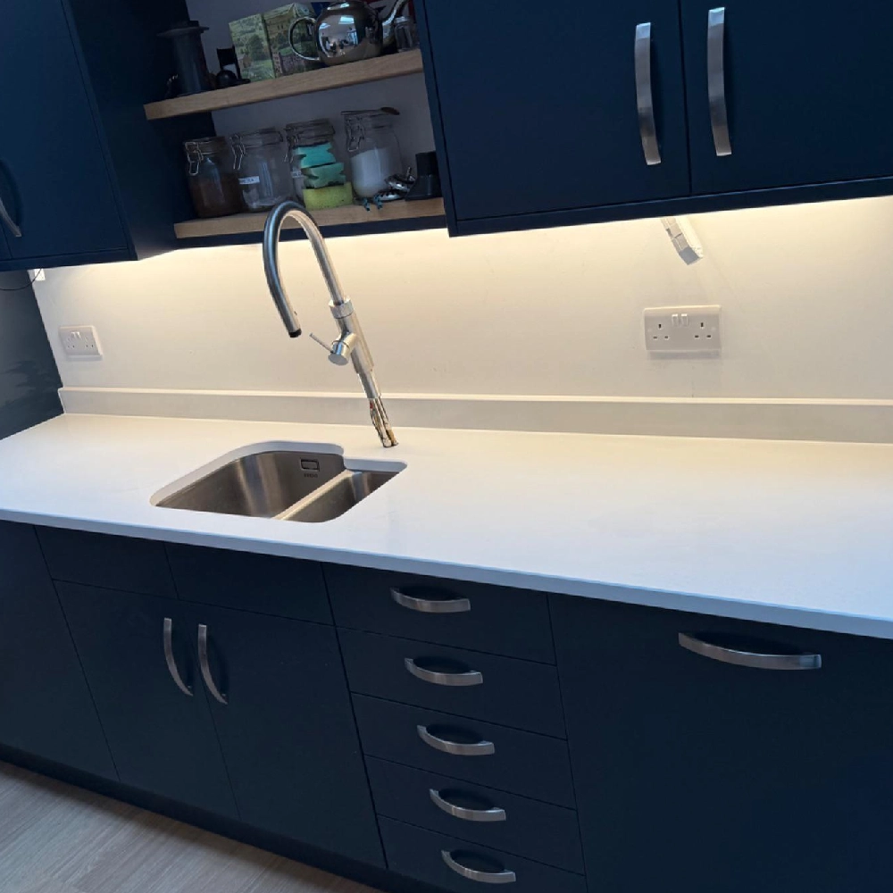
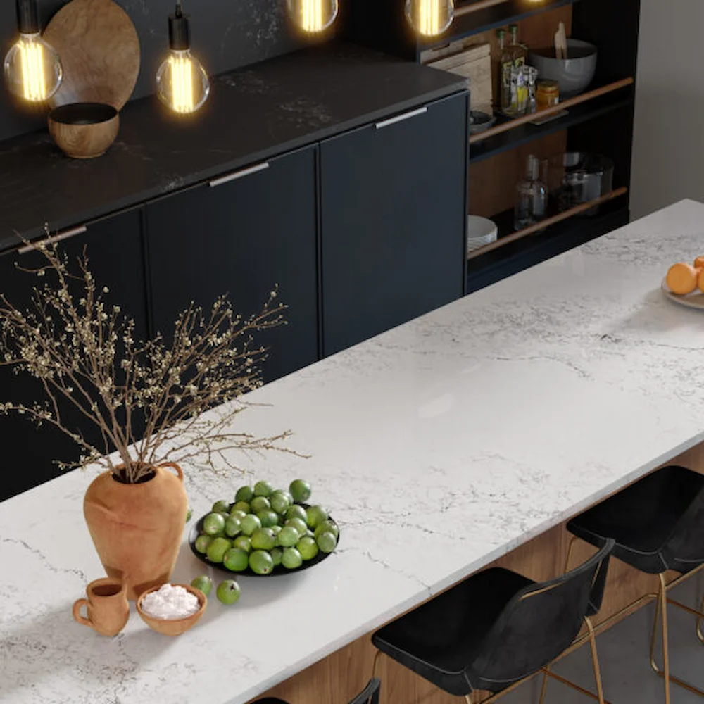
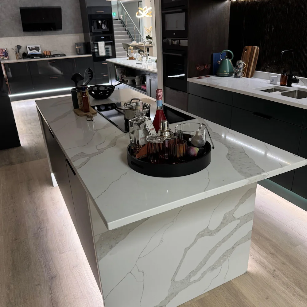
Dark cabinets almost always look best with a light worktop. The contrast defines the shape of the kitchen and stops the room feeling heavy. White Arabesque and Unique both suit charcoal and navy doors.
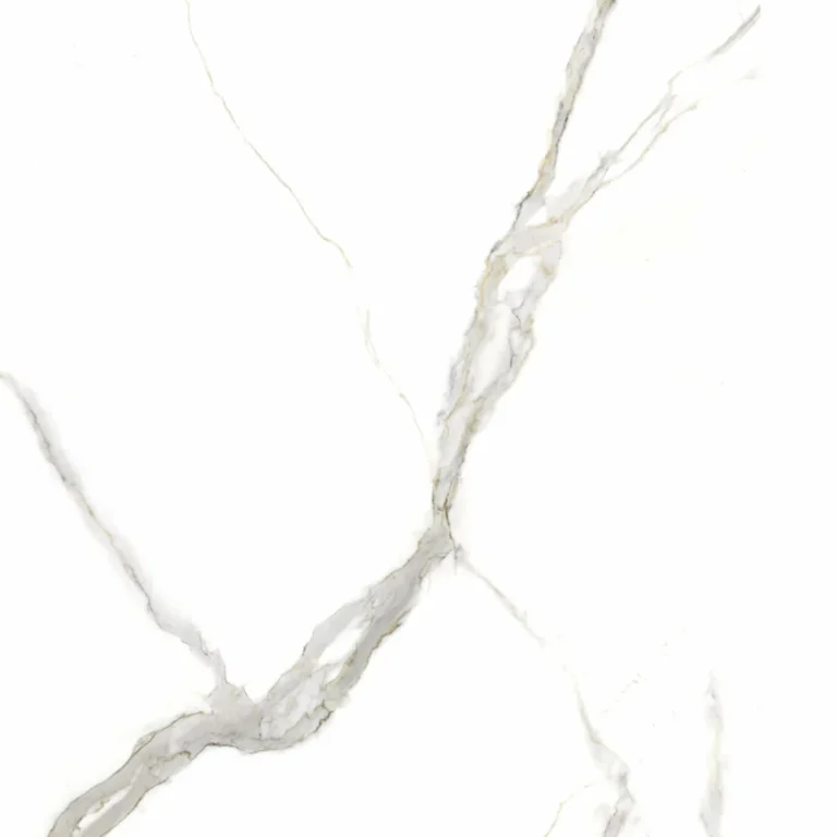
If you want more drama, a boldly veined worktop such as Calacatta Golden on a dark island makes the island the focal point of the room.
Black on black kitchens
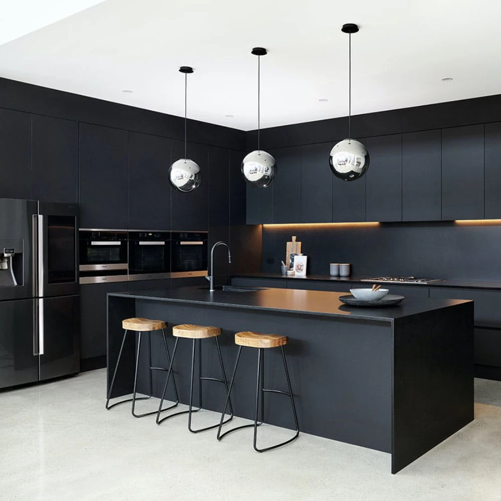
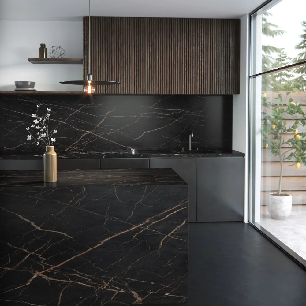
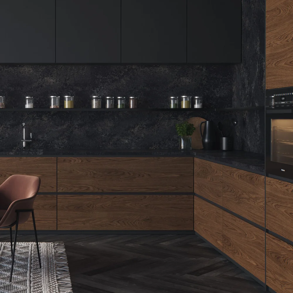
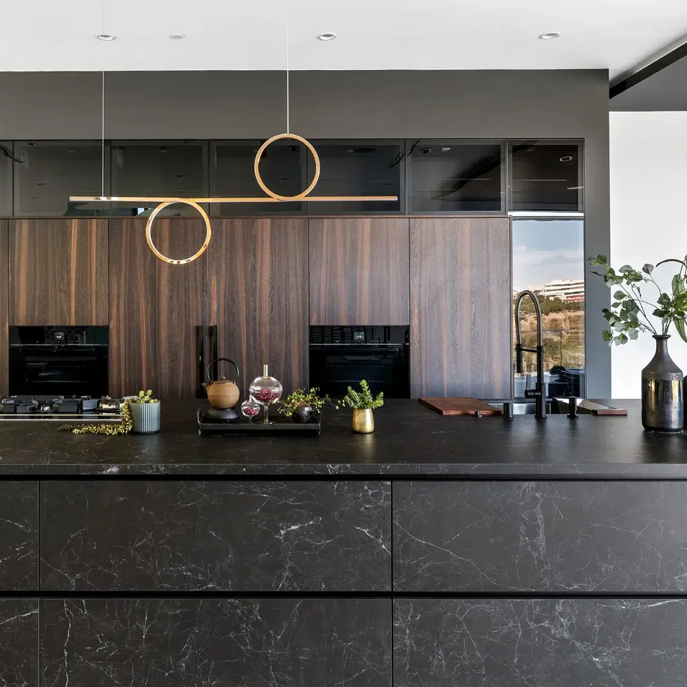
A fully dark kitchen, with black doors and a black worktop, is a confident look that photographs beautifully. It works best when something breaks it up: timber stools, a wood floor, or veining in the stone itself. Laurent has gold and copper veining that adds warmth to an otherwise dark scheme. Black appliances disappear into this look, which keeps it calm and uncluttered.
See our dark worktops.
Cream and beige kitchens
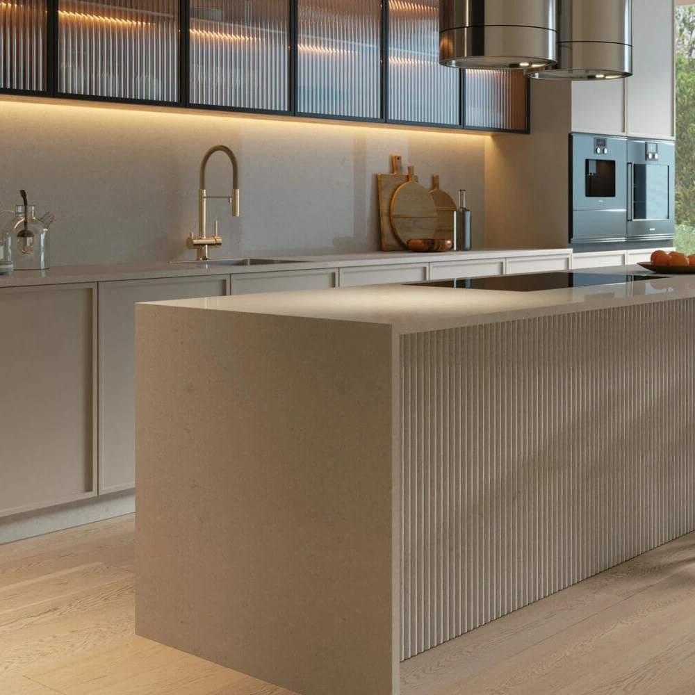
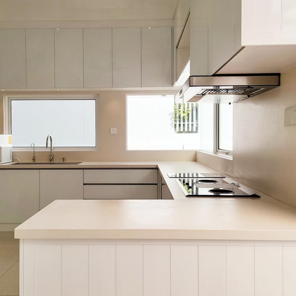
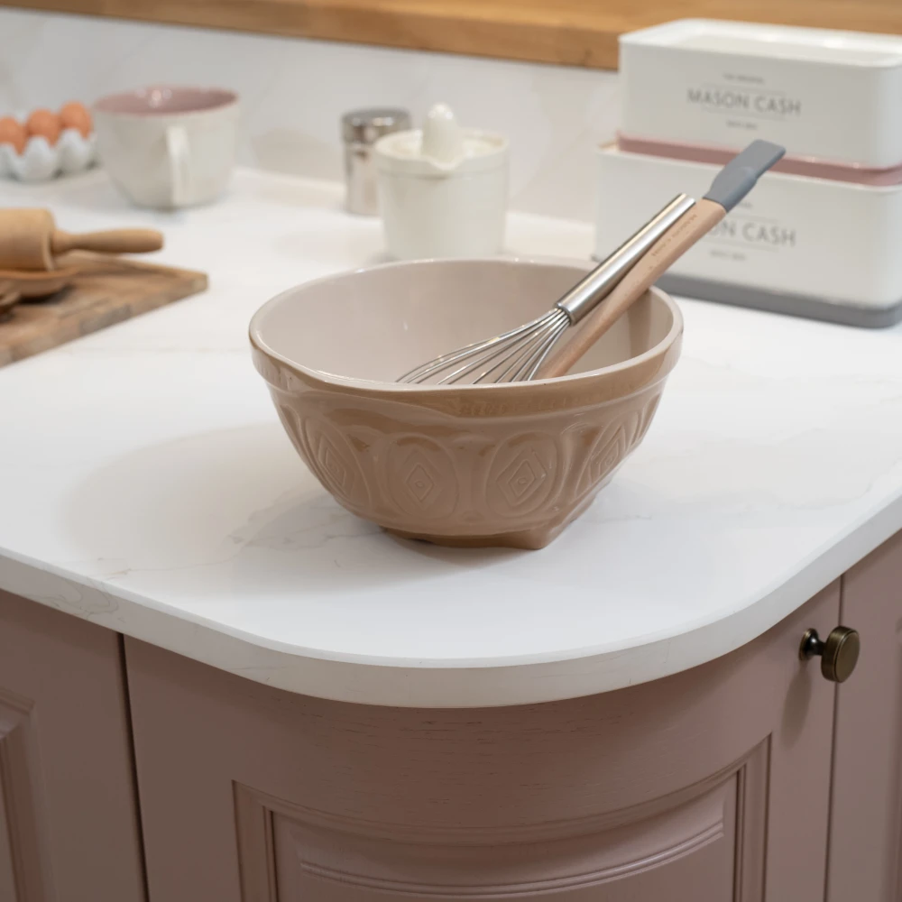
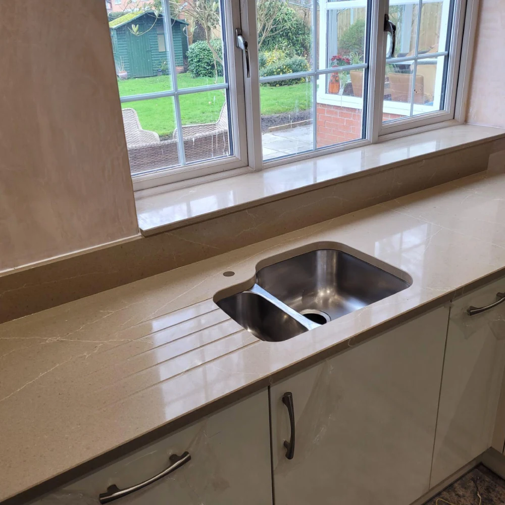
Cream doors look their best with warm worktops: soft beiges, warm whites and stone with gold or caramel veining. Pebble and Jerusalem Stone are good examples. Avoid cool whites and stone with grey veining, which can make cream doors look dated.
Browse neutral worktops.
Oak and walnut kitchens
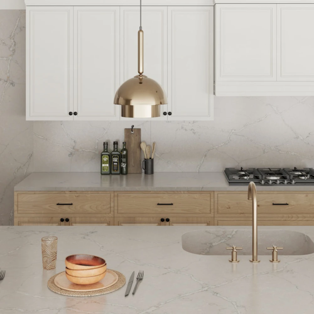
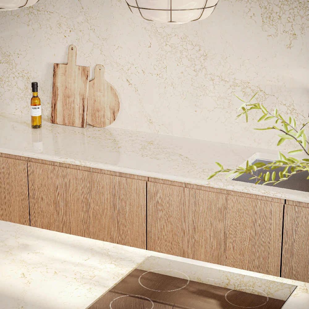
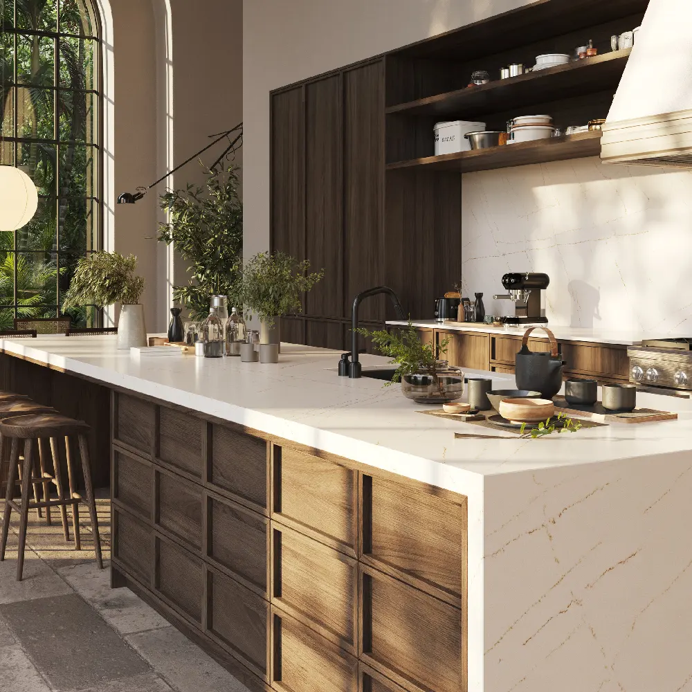
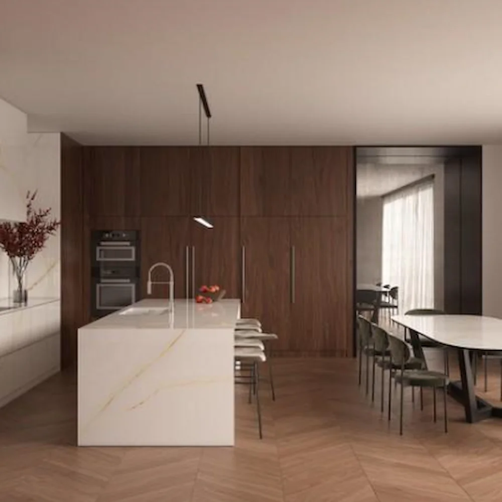
Timber cabinets already bring plenty of pattern, so the worktop should usually be the calmer of the two. Pale stone with a gentle vein, such as Victorian Silver or Goldfinch, lets the grain show. With darker walnut, a warm white with gold veining such as Christallo Gold feels rich without competing.
Quick pairing guide
| Cabinet colour | Safe choice | Bolder choice |
|---|---|---|
| White | White or marble effect | Black or dark veined |
| Grey | White | Dark grey, black or concrete |
| Sage green | Clean white | Soft warm vein |
| Dark green | Warm white or greige | Black (large, bright rooms) |
| Navy, charcoal, black | White | Bold veining on the island |
| Cream or beige | Warm white or beige | Gold or caramel veining |
| Oak or walnut | Pale, gently veined | Black for contrast |
Popular kitchen worktop colours in 2026
Trends move slowly with worktops, because nobody wants to replace one after a few years. The colours that keep coming up in the kitchens we fit are:
- Warm whites and creams. Softer than brilliant white, and easier to live with alongside wood and painted cabinets.
- Soft greige and concrete effect. A calm, neutral colour palette that suits grey, green and timber kitchens.
- Gentle marble effect veining. The look of marble with the durability of quartz, in fine grey or warm gold veins rather than heavy pattern.
- Dark stone with warm veining. Black and charcoal worktops with gold or copper veining, used as a statement on an island.
Starting with the worktop instead
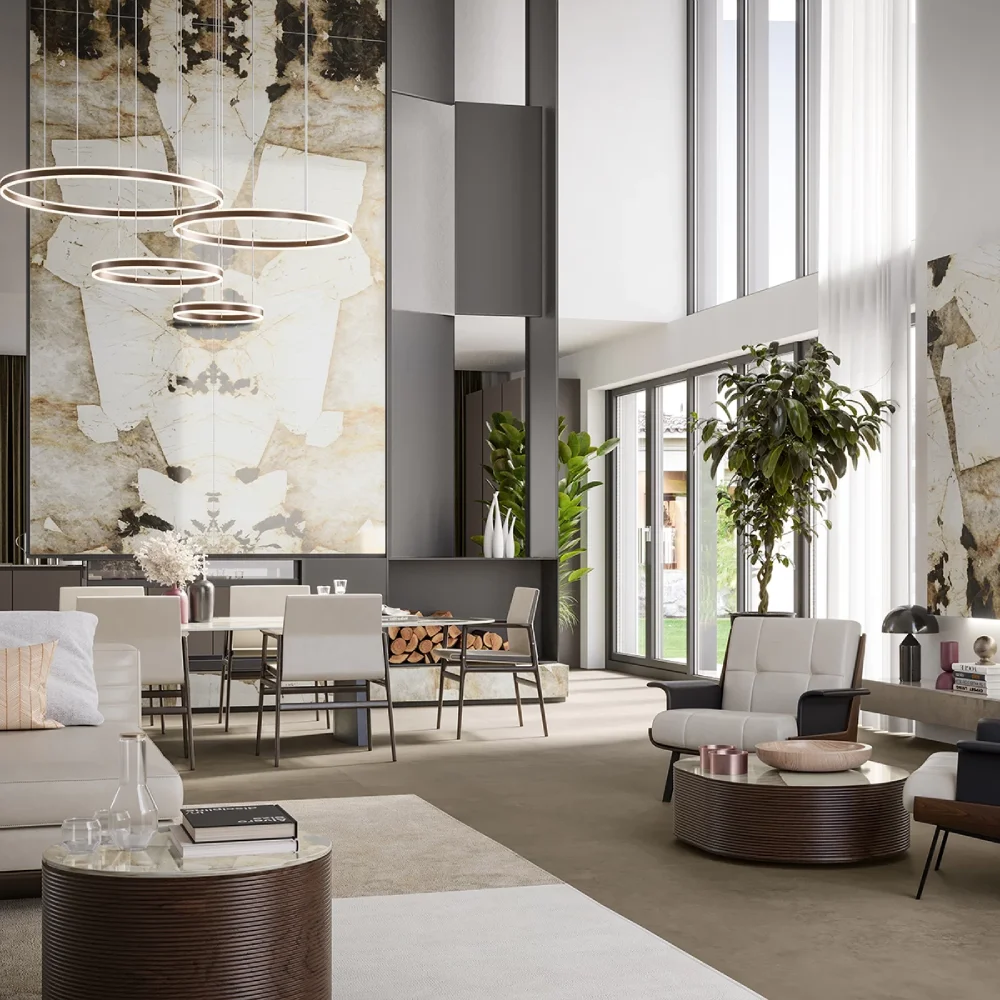
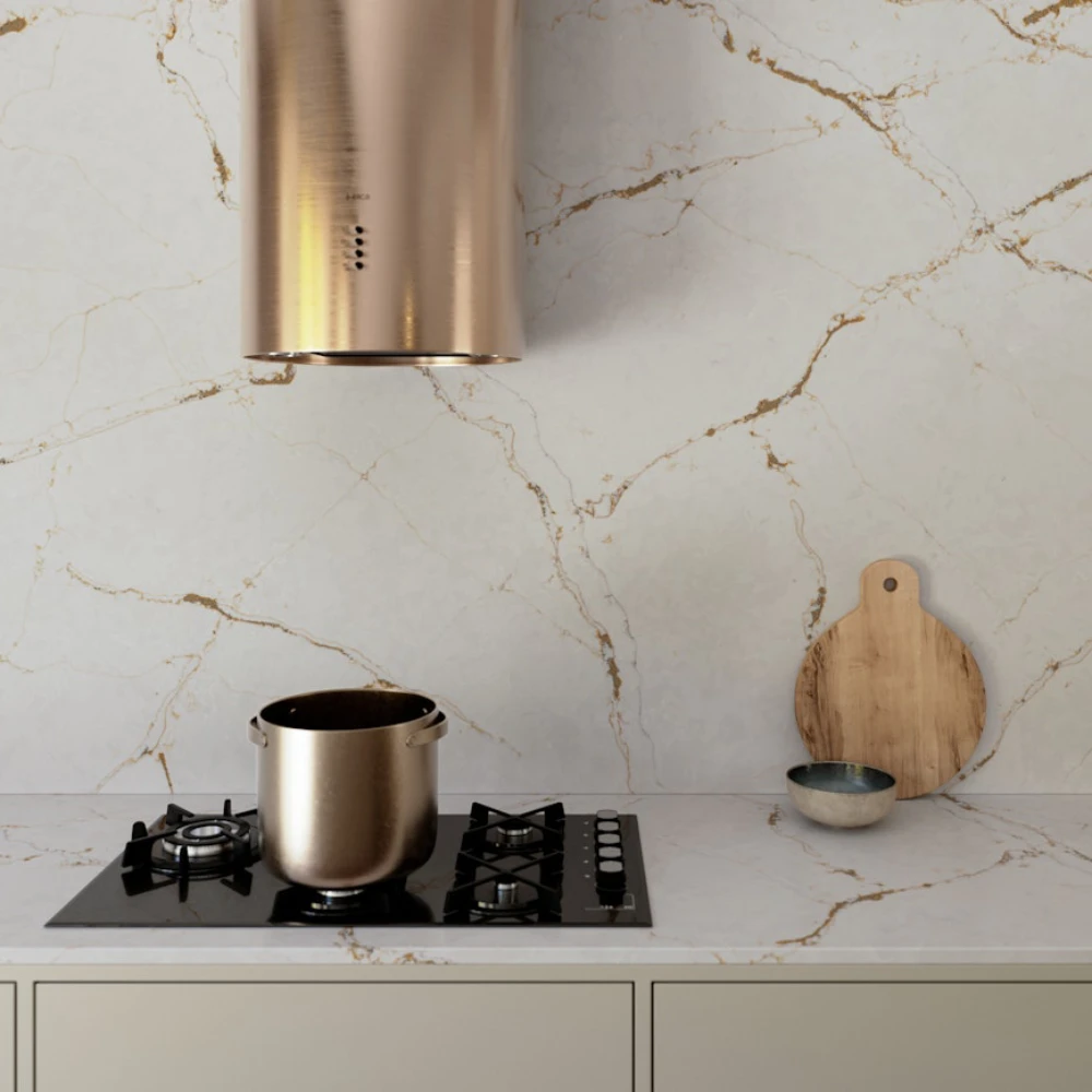
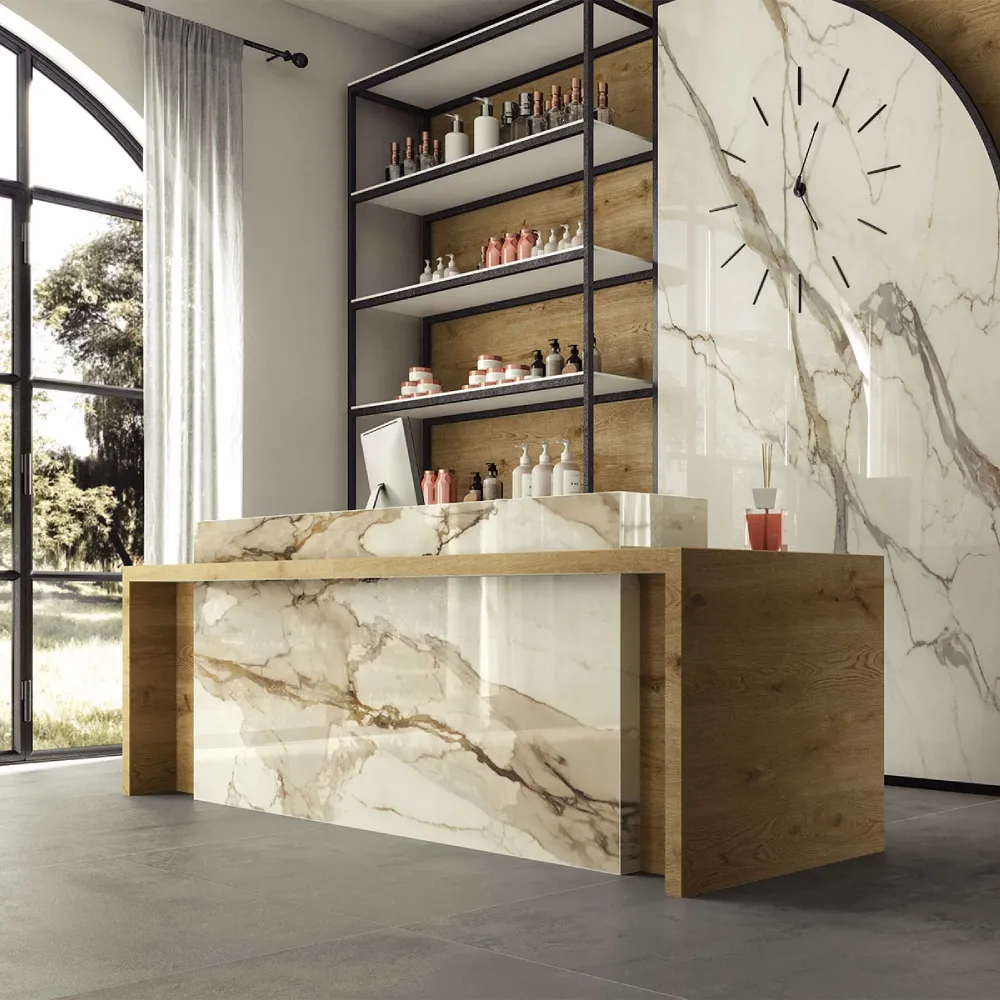
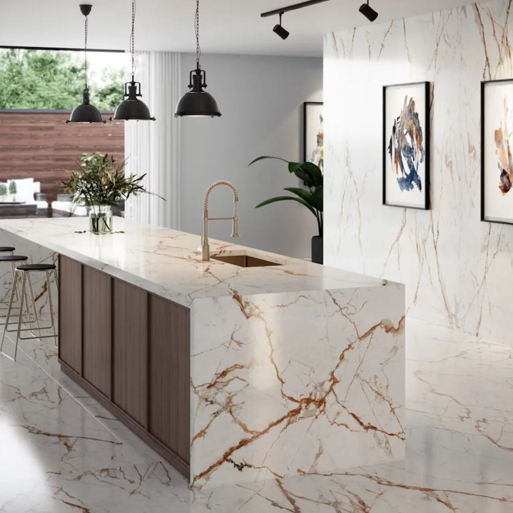
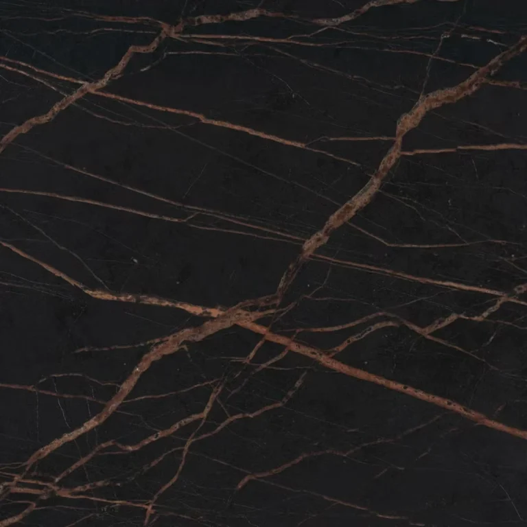
Some people fall for a stone first and build the kitchen around it. If that is you, keep everything else simple: plain doors, one metal finish and a quiet floor. A statement stone such as Desert Soul needs space to be seen.
Carrying the worktop up the wall as a full-height splashback, as with Versailles Ivory above, makes the most of a striking vein and is easier to clean than tiles and grout.
Practical things to check before you decide
- Finish changes colour. The same stone looks darker and richer polished, and softer and lighter in a matt finish.
- Light changes everything. A north-facing kitchen will make cool greys look colder. Warm whites are safer in low light.
- Think about upkeep. Very dark and very plain surfaces show marks most. Mid tones with some pattern are the most forgiving.
- Look at a large piece. Veining that looks busy on a small sample often looks calm across a full run of worktop.
- Material affects colour too. Quartz worktops (engineered stone) give the most consistent colour and pattern. Granite and other natural stone vary from slab to slab, so choose from the actual slab where you can. Porcelain and Dekton are highly heat resistant, while quartz is resistant to stains and easy to clean but should be protected from hot pans. All of them outlast laminate by many years.
Find your colour
We fabricate and install quartz, granite, porcelain and Dekton worktops across the UK. Pick a colour to see every worktop in it.